
Hi, I'm glad you're here; you must have seen my first post The Basic Design, right?
In this section, we will talk about Grid and Layout.
Grid is one of the most essential principles in interface design, it is a set of horizontal and vertical lines that divide the screen into columns and rows, when you first use grid you will find it a bit difficult to reach, but let's learn about it.
What is a grid in UI design?
As mentioned earlier, a grid is a set of horizontal and vertical lines that divide the screen into columns and rows.
Grids help ensure consistent spacing between elements by creating a structure between screens. Let's see what they have
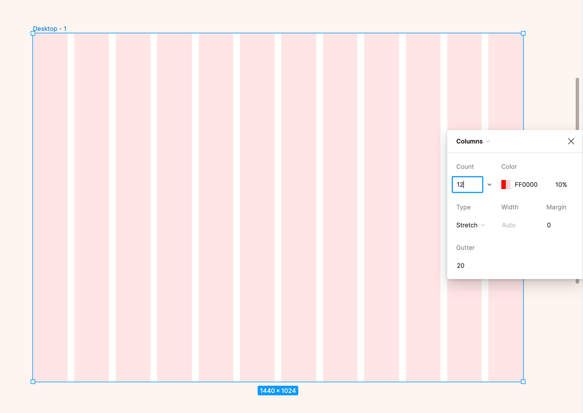
Columns
Columns are the vertical parts of the grid. The more columns the grid has, the more flexible it is. Most web designs use 12 columns
Rows
Rows are the horizontal part of the grid. They are very rarely used in web design. In most cases, grids are based on columns
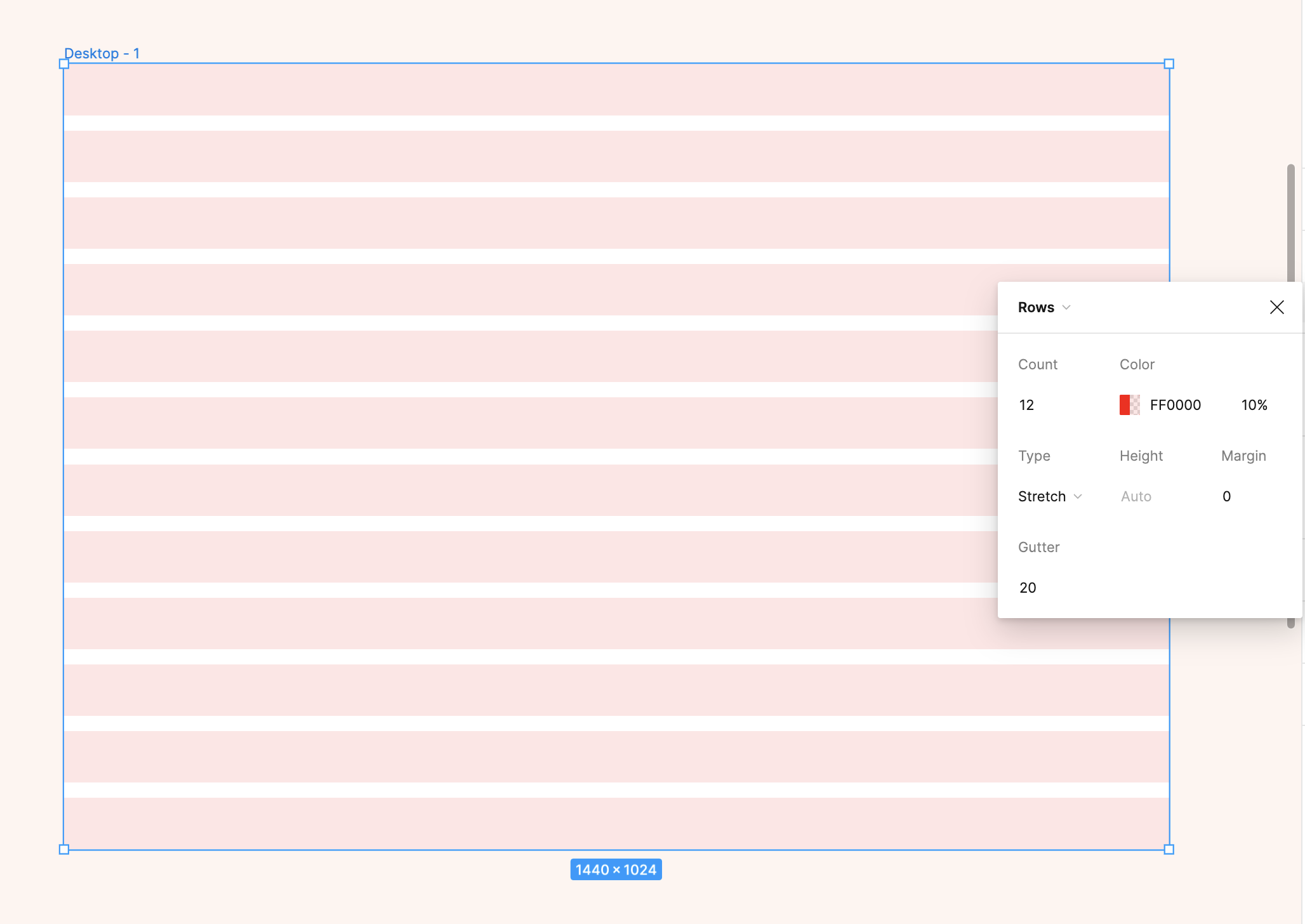
Gutters
The gutter is the space that divides the column and row. The smaller the gutter, the tighter the content on the screen
Margins
Margins are the spaces on either side of the outer edges of columns/rows and tracks. You can set them to zero, but if you want more comfortable space on either side you can set it.
Modules
The area at which a column and a row intersect is called a module
Why is it important to use grids in design?
As you know about the grid component including columns, rows, gutters, modules, but why use them?
1. Grids bring structure and clarity to your designs
If you point elements in your design at random across the screen, you'll immediately end up with an unorganized mess. By applying a grid, you can ensure that all elements of your design are aligned.
2. Grids make digital products easier to use
As you learned in Basic Design 01, elements that are close together will naturally seem more related than elements that are far apart. So using a grid will help you create a hierarchy inside your design.
3. Grids make grouping much easier
A grid system can be thought of as a frame for placing elements. This way it's a lot easier to group elements. When elements know which groups they should and shouldn't belong to, designs are more consistent.
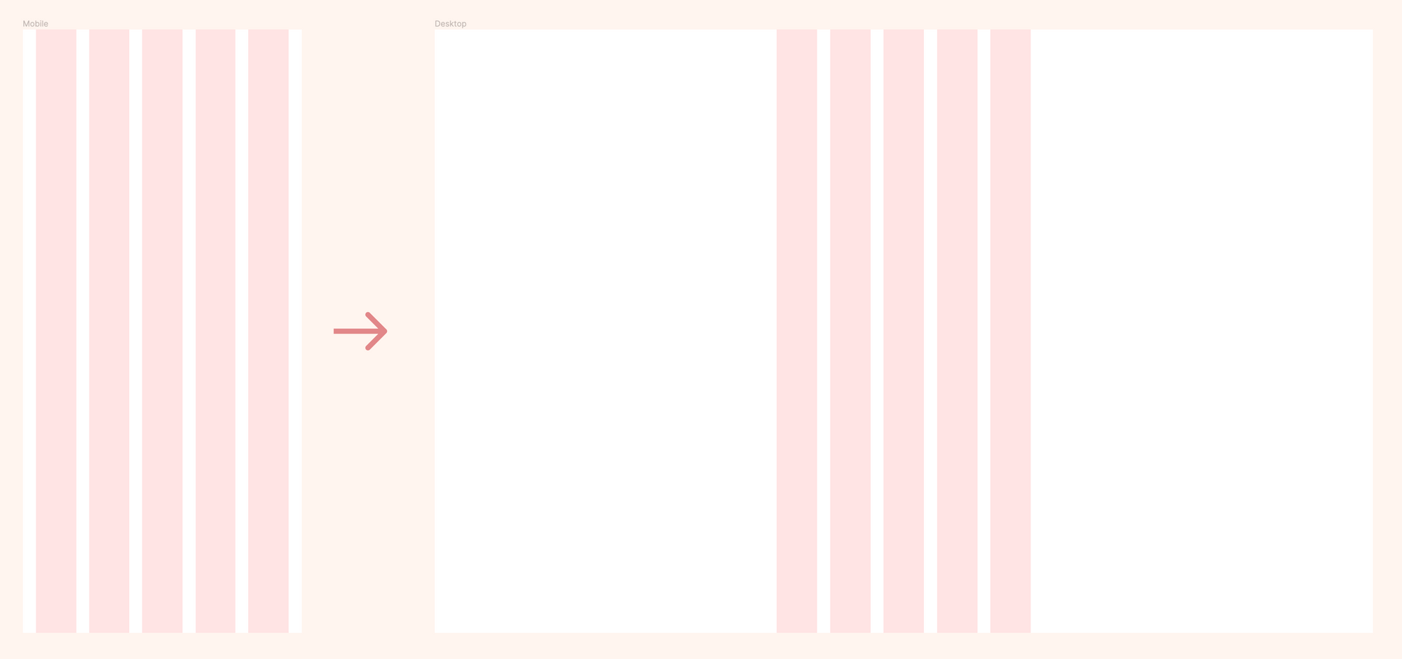
4. A grid makes the design responsive
Currently, there are many types of devices used from small screens like phones to large screens like TVs, so responsive design is necessary. Grids make it easier to lay out elements on each device.
GRID TYPES
Actually, there are not too many types of grids in UI design, it is quite useful to know which ones are used frequently.
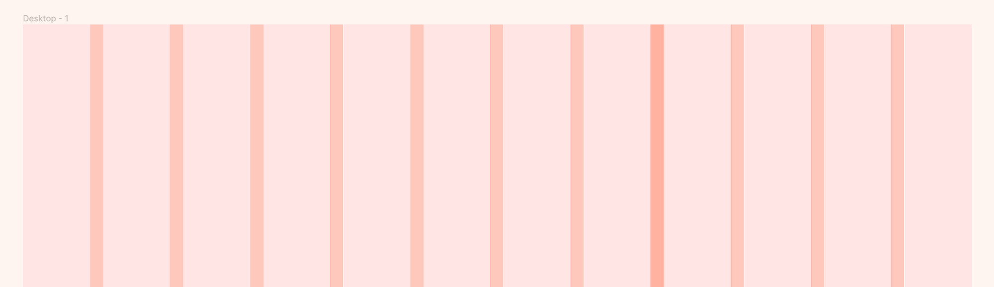
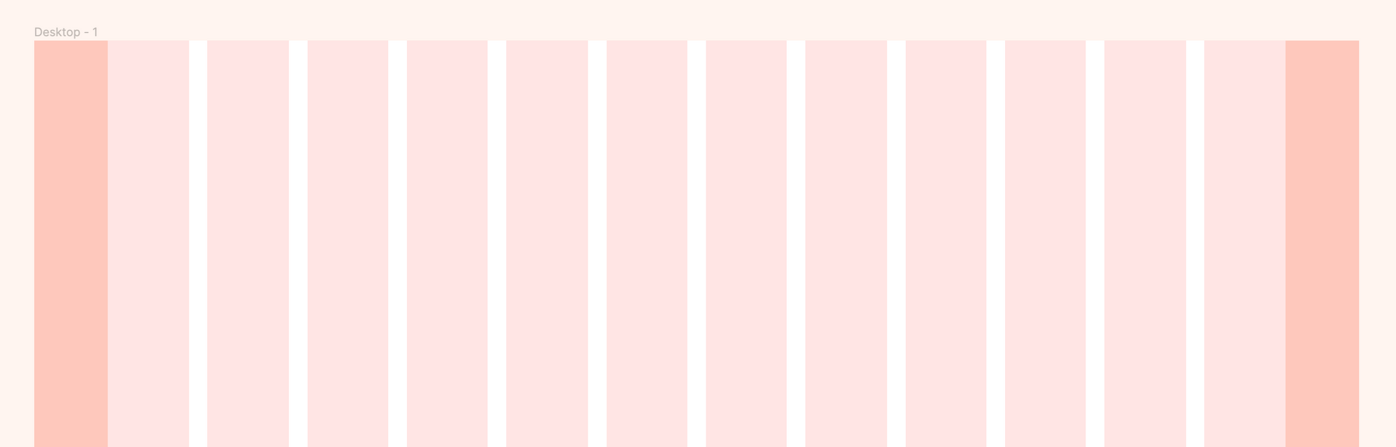
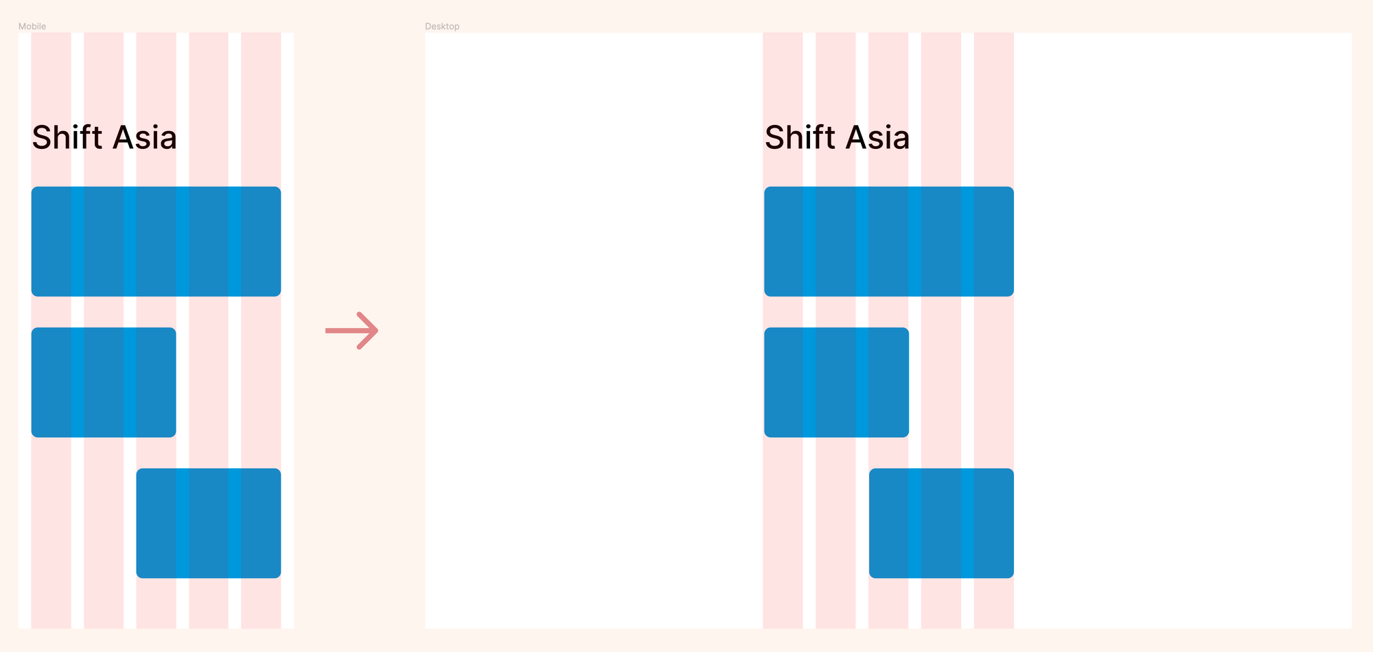
1.Fluid grid
In a fluid grid, the column width changes based on the screen width, while the margin and gutter are fixed. The size of the content changes based on the screen size, therefore this grid type is suitable for responsive interface design.
Take a look at the example below to see how the fluid grid works.
As you can see, the width of the objects changes based on the screen size, but their margins from the screen edges are the same. Also, since digital products are used on so many devices these days, using a fluid grid makes it easier to design responsive interfaces.
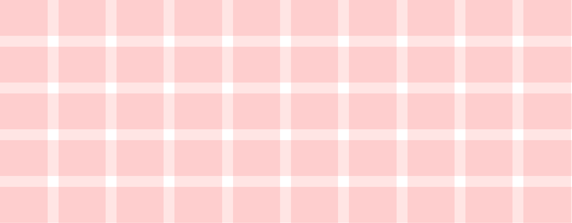
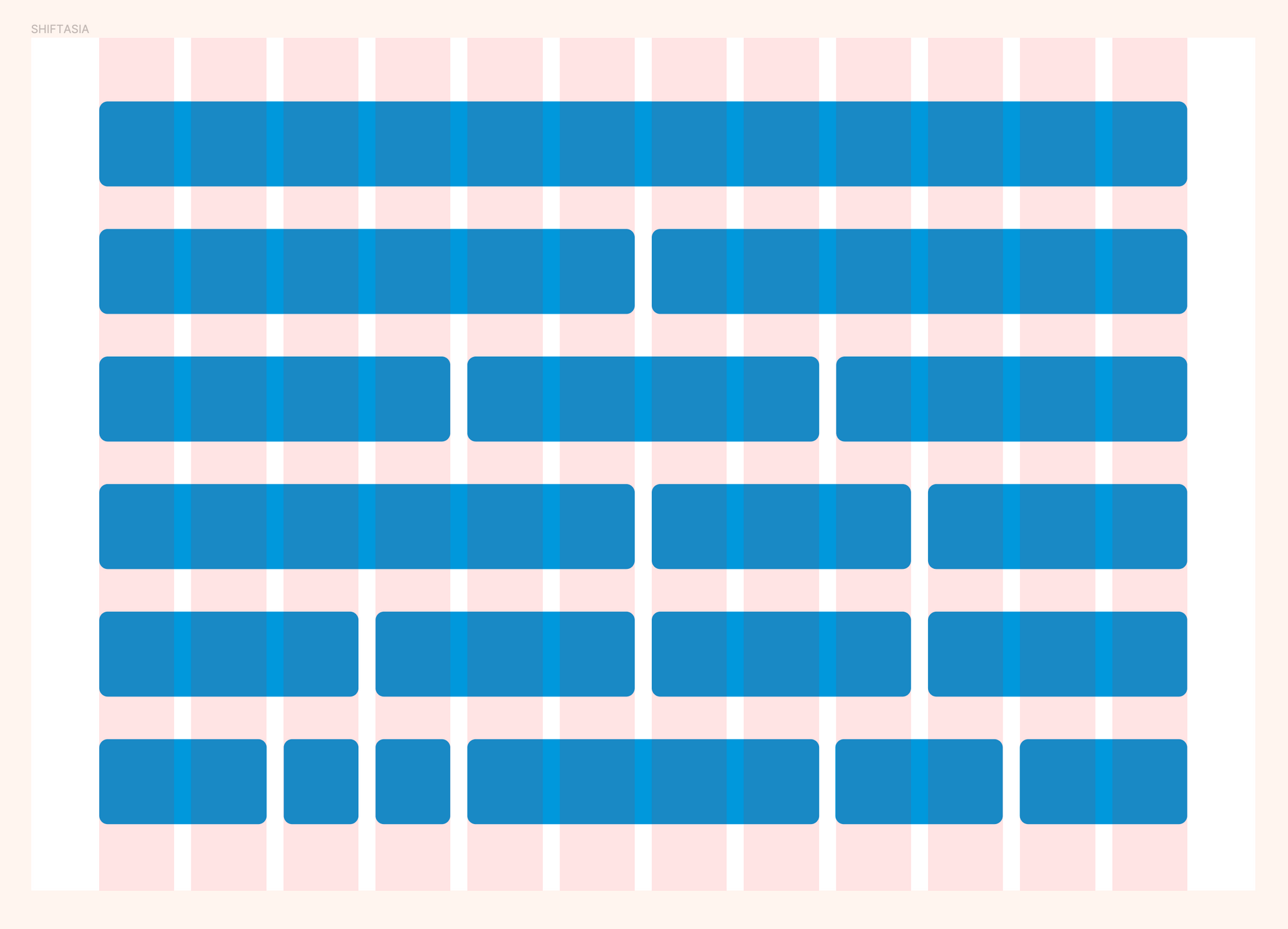
2. Flex grid
A flexed grid has a fixed value of columns and gutters, with margin width that changes based on screen width.
Since columns and gutters have set values that don't change based on screen size, fixed grids work well for designing content that doesn't need to change layout on different screens.
However, using a fixed grid won't support responsive layouts but for content types that don't need to depend too much on layout changes, it's more appropriate to use a fixed grid in design.
Reference example :
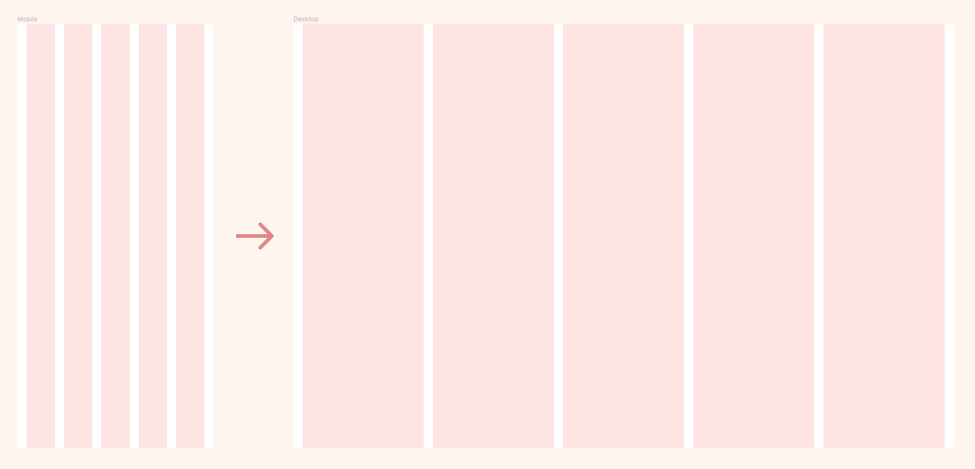
How many columns should I use in the grid?
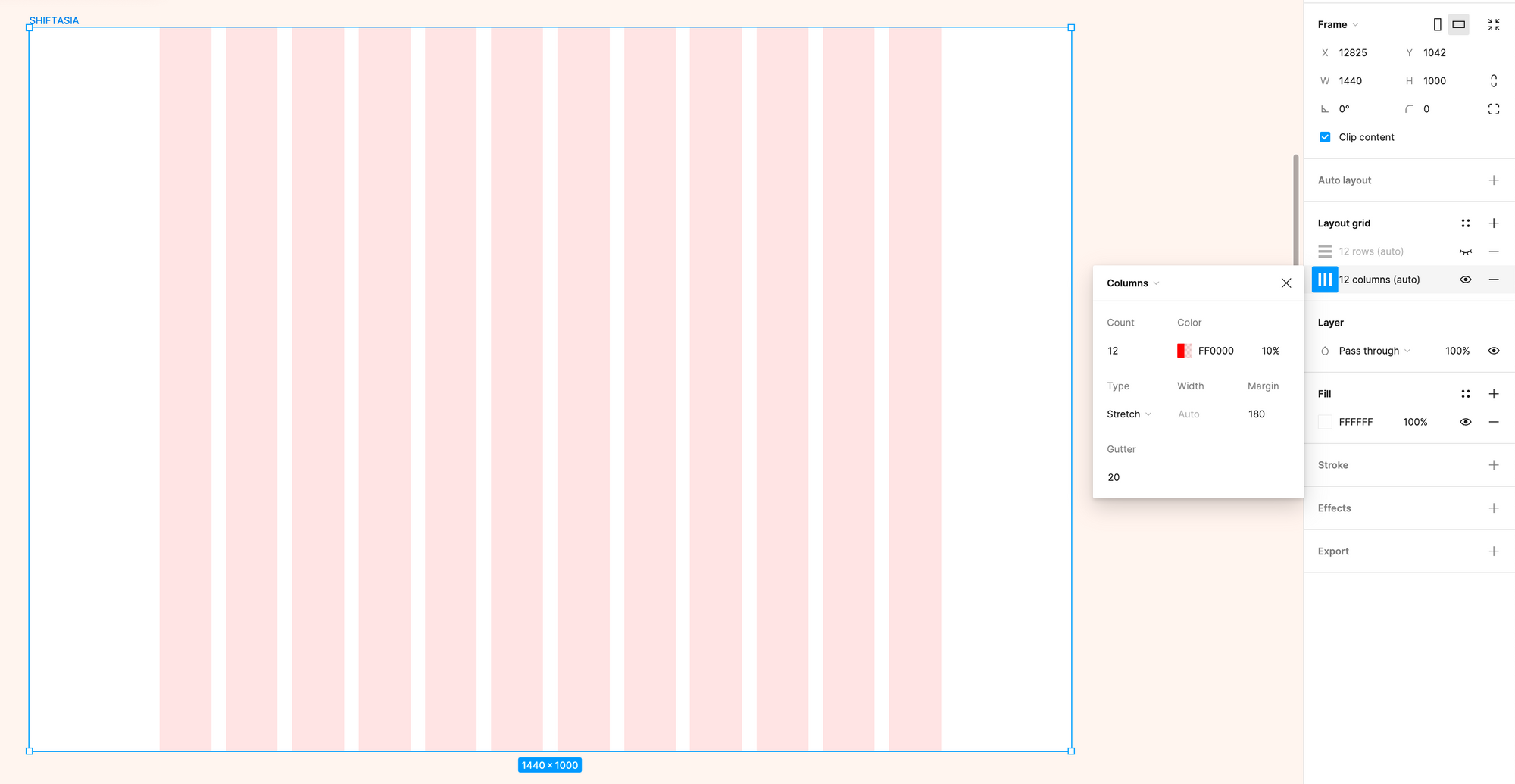
This is the question everyone will ask themselves when they first start creating a new grid, usually people use 12 columns. By this way the grid can be divisible by many small numbers like 12, 6, 4, 3, 2 and 1, so your layout will be very flexible.
Above you can see an example of a 12-column grid. Although it is the most common one in web design, not all designs need 12 columns sometimes just 8 columns is enough. You should note that do not use odd values like 5,7,11 because they are only divisible by themselves, so layout flexibility is more difficult when using them. You can sketch out your design on paper to determine how many columns you need to use.
If you're not sure, just start with 12 columns. Then in the process you can customize it properly.
Example of how to setup grid :
After deciding the number of columns you can use the steps below to setup the grid in the design.
Step 1. Find the width of your design screen
First, find the width of your screen. Let's use 1440 as an example.
Step 2. Set up gutter and margin width
The smaller the width of the gutter, the tighter the contents of the screen. Although there are no specific rules, you can use 12 pt, 14 pt, 16 pt or 20 pt for gutter and 160 pt or 180 pt for margins (this applies to web interfaces). So in this example we will use 20 pt for the gutter and 160 pt for the margin.
Step 3. Find the number of gutters
Your formula is "gutters = columns - 1"
Ex : If you have 12 columns you will have 11 gutters. This is easy right :)
Step 4. Calculate width of content
Your formula is "screen width - (gutters number * gutter width) - (margin number * margin width) = content width"
Ex : 1440 - (11 * 20) - (2 * 160) = 900
Step 5. Calculate width of columns
You have 12 columns and your content width is 900 ( at step 4 ) so
Your columns width is : content width / columns numbers = columns width
Ex : 900 / 12 = 75
Hope you enjoy :)
See you in the next chapter : UI Design 102 - Principles - 02 Typography