In this first article on the topic of UI Design, I will show you the most basic concepts of what is UI Design? What does it include and how to make it good.
This article only covers the very basic concepts, but I think it is essential for beginners to learn about UI Design.
If you have experience or know about them, you can skip this article, and see you in the upcoming UI Design 102 - Principles :)
Let's start!
What is UI Design?
UI Design refers to the visual element in terms of the form and style of a digital product (not including the user experience element).
What factors determine a good User Interface?
A product with a beautiful UI is one that is usable and enjoyable for the user.
For example, there are 2 products
-Nice design but not usable, does not meet the purpose of work
-Bad design but usable for the purpose of work
Which product would you choose to use? If it were me, I would choose what works for me before prioritizing aesthetics :)
So, what is availability?
Usability is the ease and comfort of functions while using the product.
What is enjoyable?
In addition to usability, it is also important to make users feel happy and engaged with the product. And everyone's preferences are different, so there is often a job of surveying users in the process of making products.
Users are very fastidious, they evaluate your design very quickly, if they do not like it, they will leave immediately and it is very difficult to make them come back to use your product.
Screens
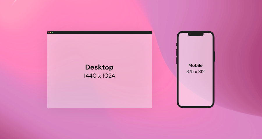
Every UI Design is placed on a certain screen such as Smartphone, Tablet, Laptop or Smartwatch has a screen to contain the content to be displayed.
Objects
These are things that are used to combine to create a design, for example shape, line, vector, text ... corresponding to each Object, there will be associated properties such as width, height, position ( X and Y )
Size - width and height
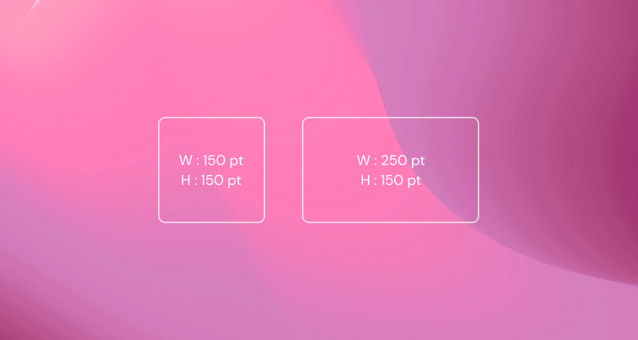
Each individual element has its own width and height dimensions expressed in pt
Position - X and Y
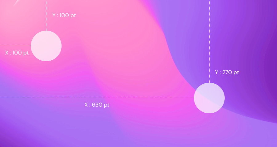
Similar to width and height, each component object has its own X and Y values, X is the distance value from the left margin to the object, Y is the distance value from the top margin to the object.
Rotation
Each object can be rotated from 0° to 360°
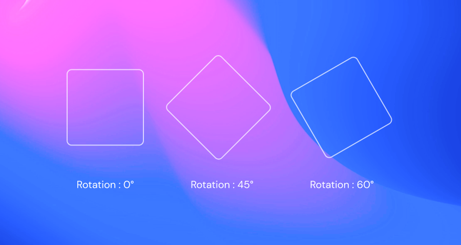
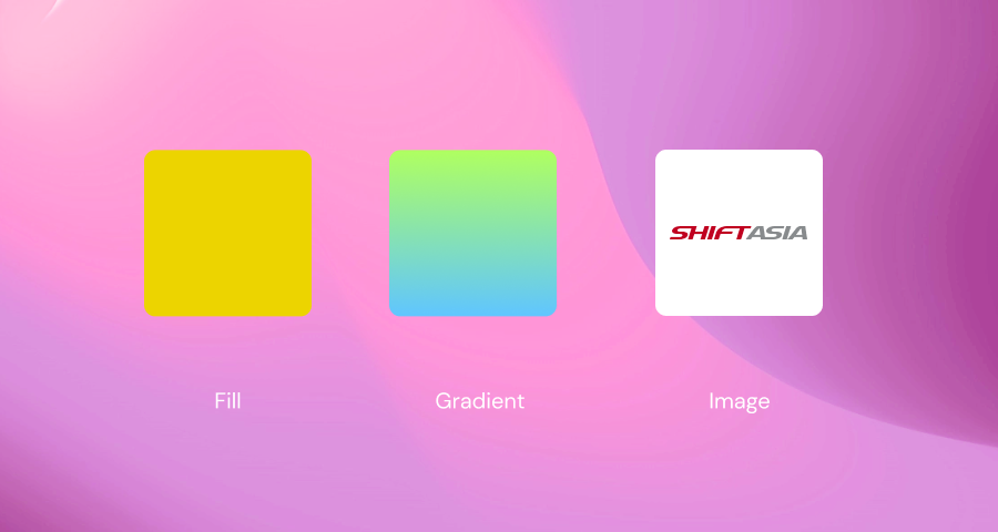
Fill
The object will have a lot of different fill states such as color, gradient, image...
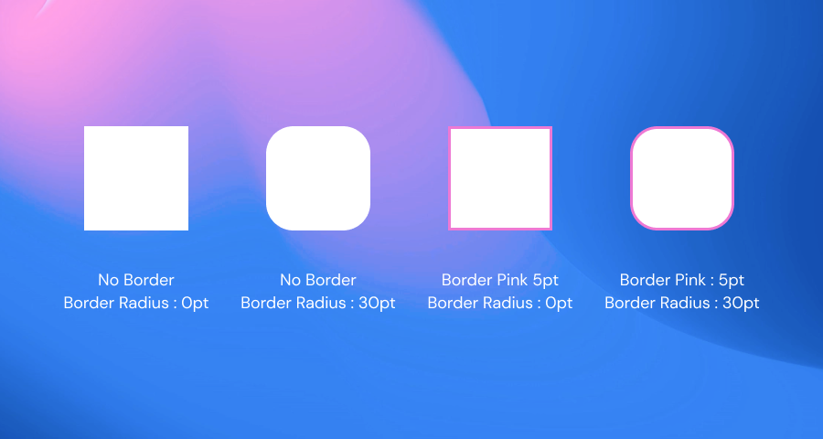
Border - Border Radius
You can also add borders to the object, and adjust the level of the object's border-radius.
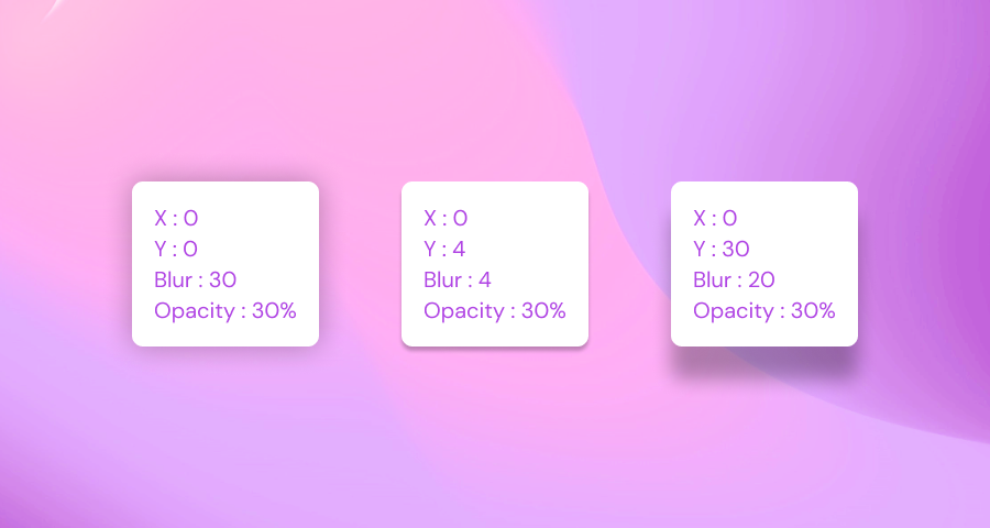
Shadows
Objects also have their own Shadow, and properties for customizing the shadow include X, Y, Blur, and Opacity.
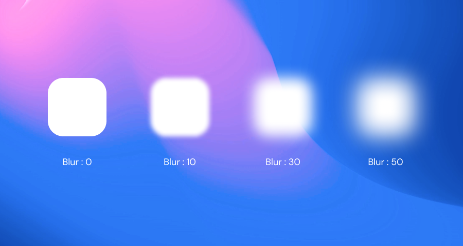
Blur
Objects can be Blurred with values from 0 to 250
Perception and Visual Hierarchy
As a designer, you want to get users to focus on what you want them to pay attention to. By changing some properties of the object, you will change the customer's visual perception.
Size
Naturally, users will often perceive that the big things will be important and they will notice it first. So you just need to adjust the size of the object reasonably to attract users.


Color
Similar to color, subjects with more prominent colors will be noticed

Position
The position of the object of the image affects the user's behavior, they will often look from top to bottom, left to right. (There are also some cultures where they have the habit of reading from right to left.)


Alignment
Objects that are asymmetrically compared to other subjects often get more attention

I pause the UI Design 101 - The Basics section here.
See you in the upcoming UI Design 102 - Principles section; you and I will go deeper into the above concepts.
Hope you enjoy :)

